

Grow For Me
Everyone uses their mobile phone to do 80% of our consumerism interactions. Having a digital id is a new approach that is on going research to find the best ways to make sure it feels real id but also making it easy for everyday busy customers.
Target users:
Bouncers & Cashier
Role:
UI Design
Duration:
6 weeks
Overview
Designing experience of digital id to explore the potential for the near future.
Problem
Losable
A small plastic card can easily be lost when mishandling can bring personal security at risk.
Illegible
80s design with cramp letter-spacing makes it more work for cashiers our bouncers to get the import information as son as possible.
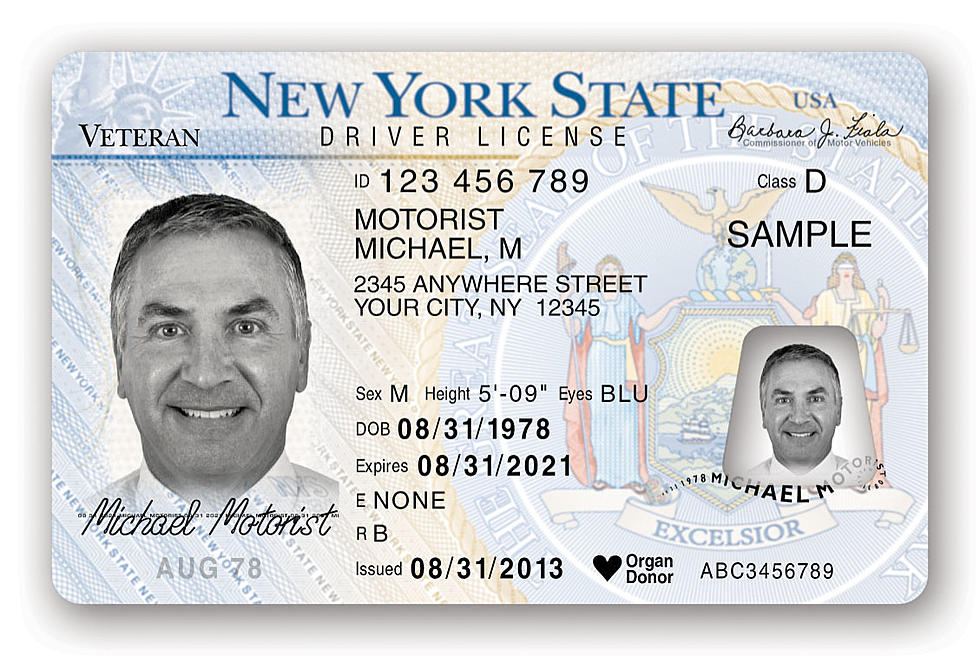
How we might improve the speed of reading of the identification card to help the user get verification faster?
Goals
Scannable
Improving the ID typography will help people scan through the id to get the check out process faster.
Custom id faces
Have more then one ID for specific use cases. Not all information needs to be addressed up front at certain events.
Secure
Providing ways to so verification the id is real and not a screenshot.
Stage 2
The approach
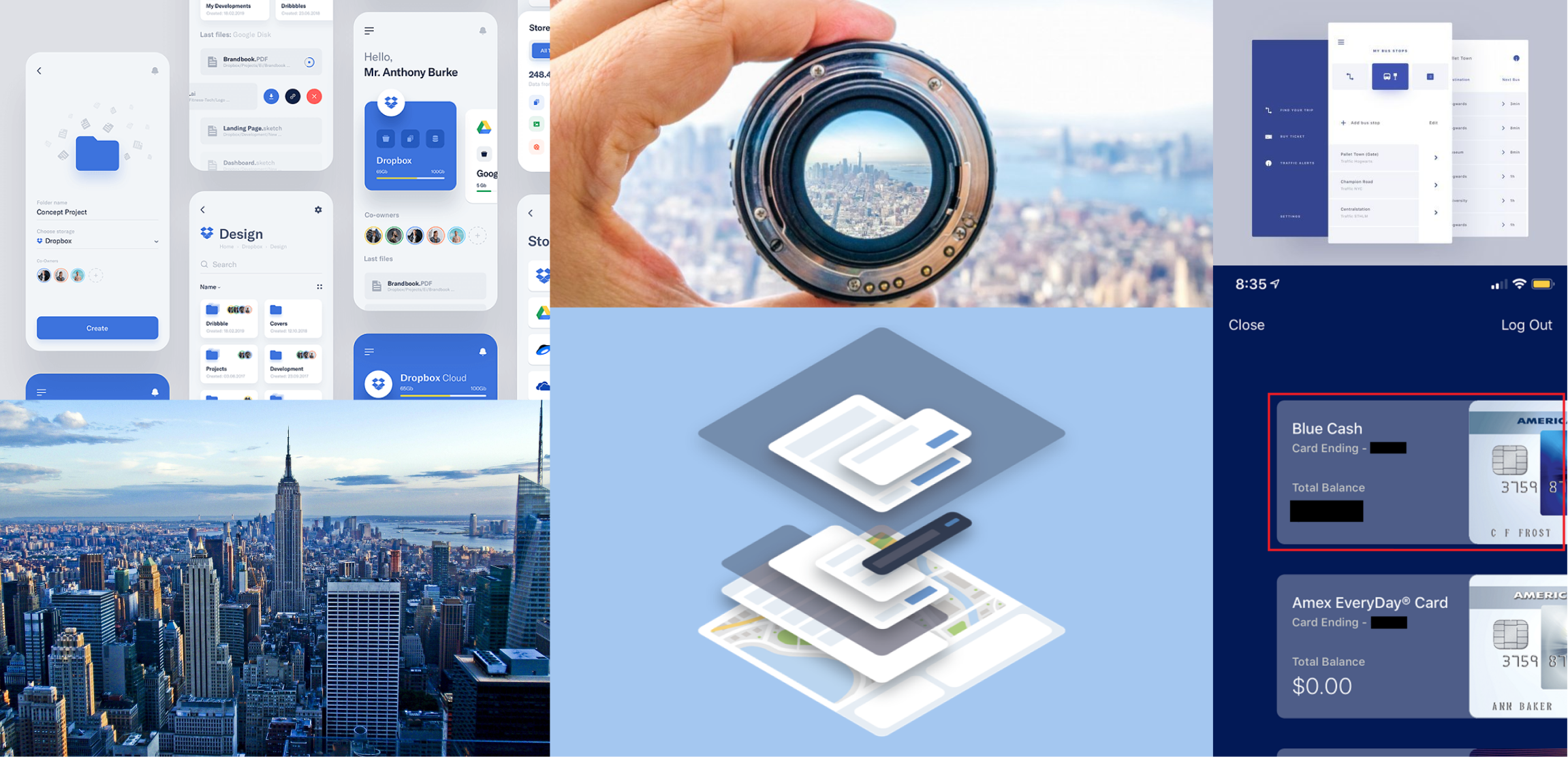
Inspiration board
The inspiration board helps me gather a quick visual idea of how I want my users to see with my twin id app. I wanted a light and new yorker feel to capture the feel a nice id that doesn't feel like it belongs to the government.
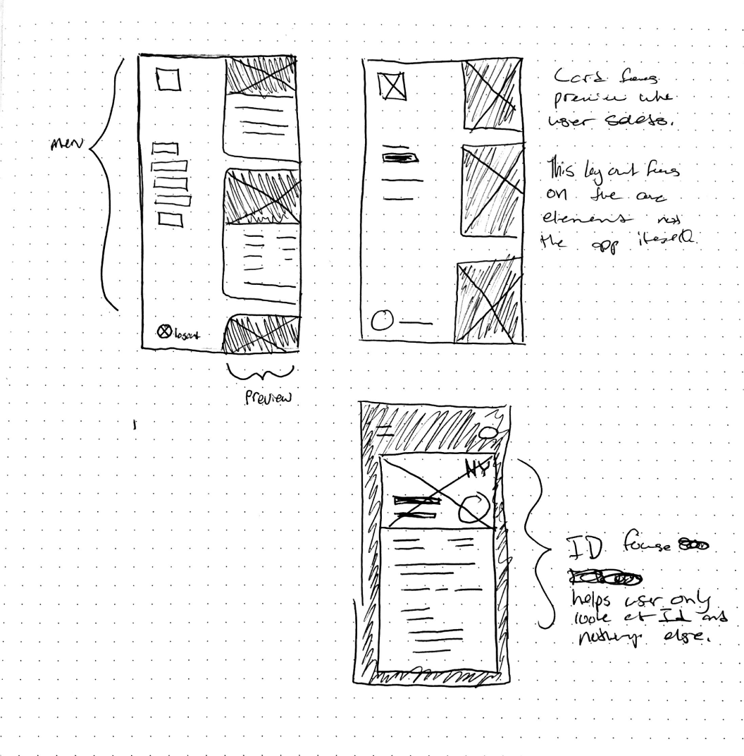
Half and half
I chose this sketch ideation because I like the hyper-focus of the ID I wanted the user to present. It helps them get what they need showing full face and sliding left to see the menu to select other ID cards
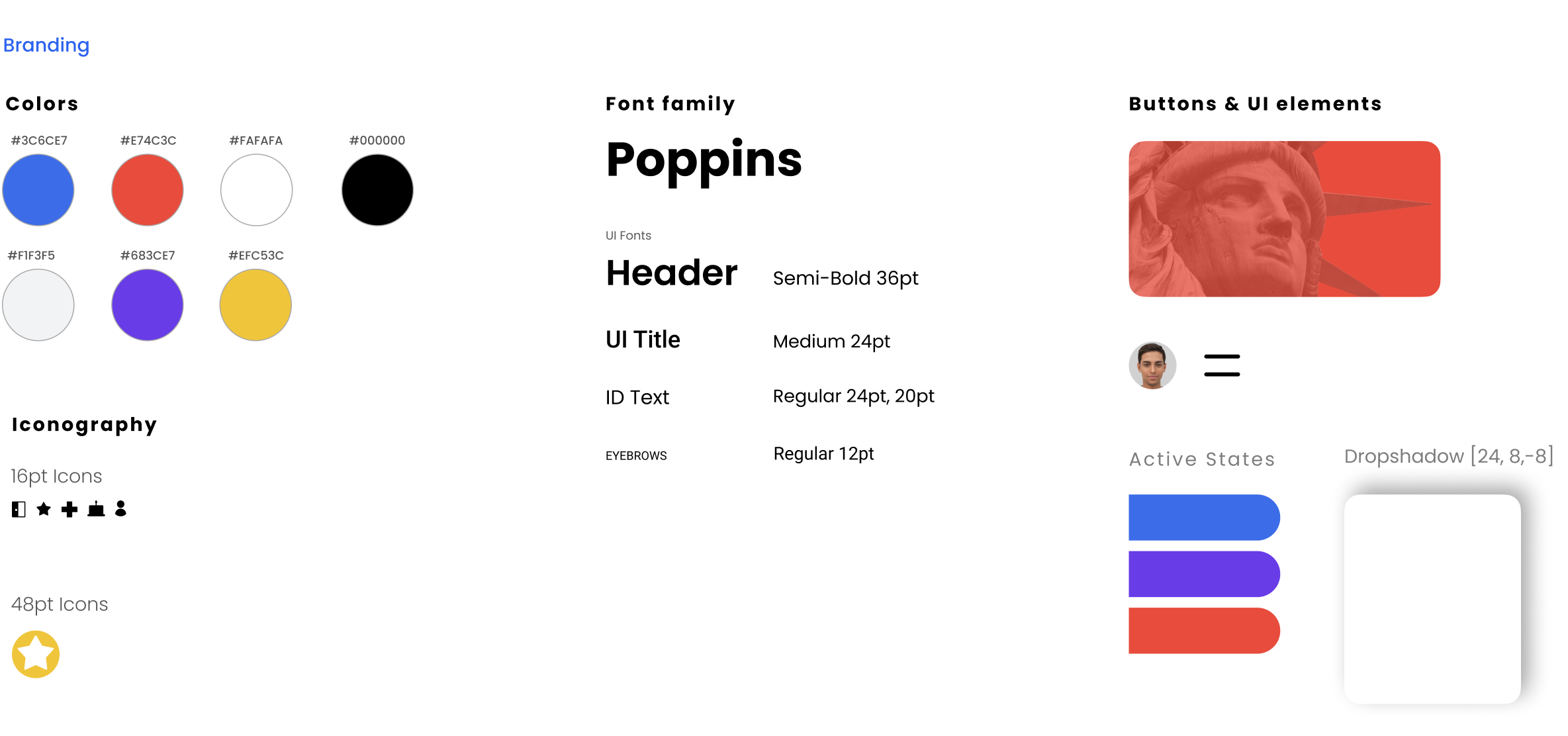
Visual branding
As for the branding, I followed what I envisioned in my mood board. I choose Poppins because it brings more character to the UI element with a strong New Yorker approach.
Conclusion
Things I've learned
Overall this project was an enjoyable visual design project. It helped me push my typography skills further with UI apps. I would go back and improve on the color branding to make it more cohesive. I also would focus on the cards on the preview on the menu mode to maybe create them a little pleasing to see.
I would go back and fix the visual elements that I found can be improved. I want to fixing the special flow how easy how managing different id cards would be for users. I also wanted to improve the visual hierarchy what id should be used most when you are opening the app.