

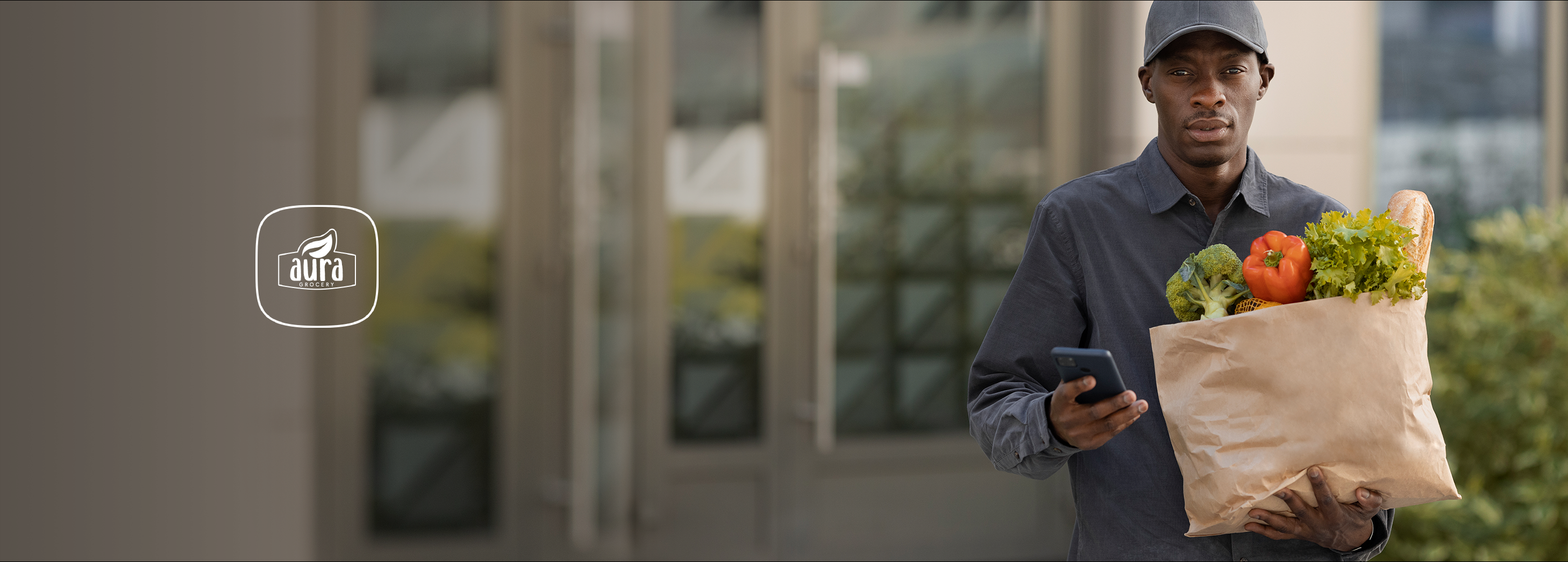
Aura Grocery
Aura grocery app helps users to buy groceries online whenever they want.They need to order for apps and they will be delivered the product with in the given time.
Target users:
People new in the City / Busy people / Sick people / The Elderly
Role:
UX and UI | Prototyping
Duration:
3 weeks
Overview
Aura grocery app helps users to buy groceries online whenever they want.
Objectives of research
Problem
1.Difficult to find the exact product people are looking for.
2.Not always good quality product delivered.
3.Delay in the time.
4.High price in product.
Solution
1.Find the exact product you are looking for
2.Good quality product
3.Saving the time
4.Having reasonable price no hiding charges
Stage 1
Design Process
Discovery / Define / Ideate / Design / Develop / Test
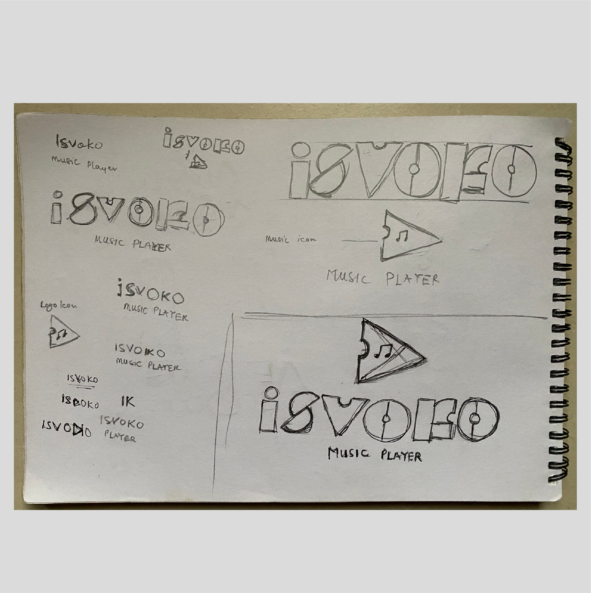
Stage 1:Logo sketch
The sketch logo concept stage is the initial phase of transforming ideas into visual form. At this point, rough hand-drawn sketches are created to explore different design directions, shapes, and symbols. It allows for quick experimentation, flexibility, and the freedom to refine concepts before moving into detailed digital design.
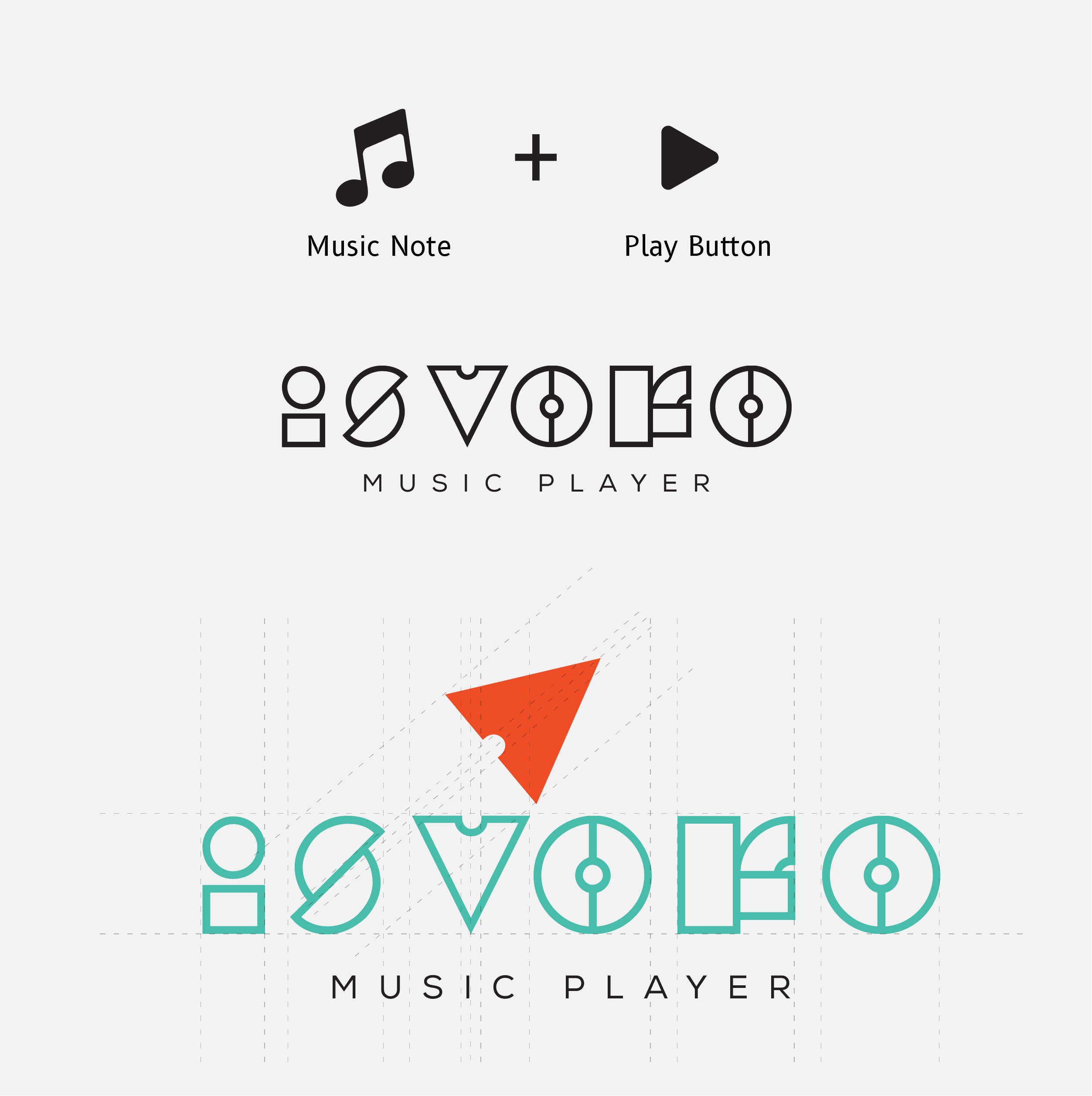
Stage 2:Logo Design
The logo design stage is the process of transforming brand identity into a visual mark that communicates its values, personality, and purpose. At this stage, designers explore concepts, experiment with typography, colors, and symbols, and refine ideas into a simple, memorable, and versatile design. The goal is to create a logo that not only stands out but also resonates with the target audience and remains adaptable across different mediums.
" If you can make a compelling argument, and win enough minds, and if you can transform various parts of our world sufficiently, then the moment belongs to you."
- Debbie Millman
Stage 1
Research
There are music lovers everywhere in the world. But the favourites vary from person to person. Numerous and variety of playlists are being created worldwide daily. By providing smooth interaction and multiple actions to perform in one platform makes it easy and more handy for music lovers.
Objectives of research
Point 1
To provide efficient switching to next song or other playlists.
Point 2
To be able to carry out multiple actions any user wishes to have in one app.
Point 3
All of the above listings can be done in one single application with simple navigation and clear interface. My research begins with the readings of some of the questions and answers on Quora and Google about music using Audiomack reviews.
I looked at and explored some applications like WYNK, GAANA, Hungama, GOOGLE PLAY Audio mack etc. To know what users like and what they still wish to have in these existing applications, I have went through Reviews on play store. Coming to user experience and navigation, referring to some of the music articles on Medium was a great impact wherein the designer’s point of view can be understood in designing the application. During my research, the major pain point I have seen about music apps for users is Ads.The ads annoy users during their music. But from a business perspective, it is slightly important to provide ads. So, ads cam promoted in such a way that user also does not get annoyed and from a business perspective also it is achieved. This can be done by promoting the ads either at the start or end of the song. One more way is to promote ads after the number of songs listened by the user from his playlist followed by ads and again at the stretch can continue with a set of songs.
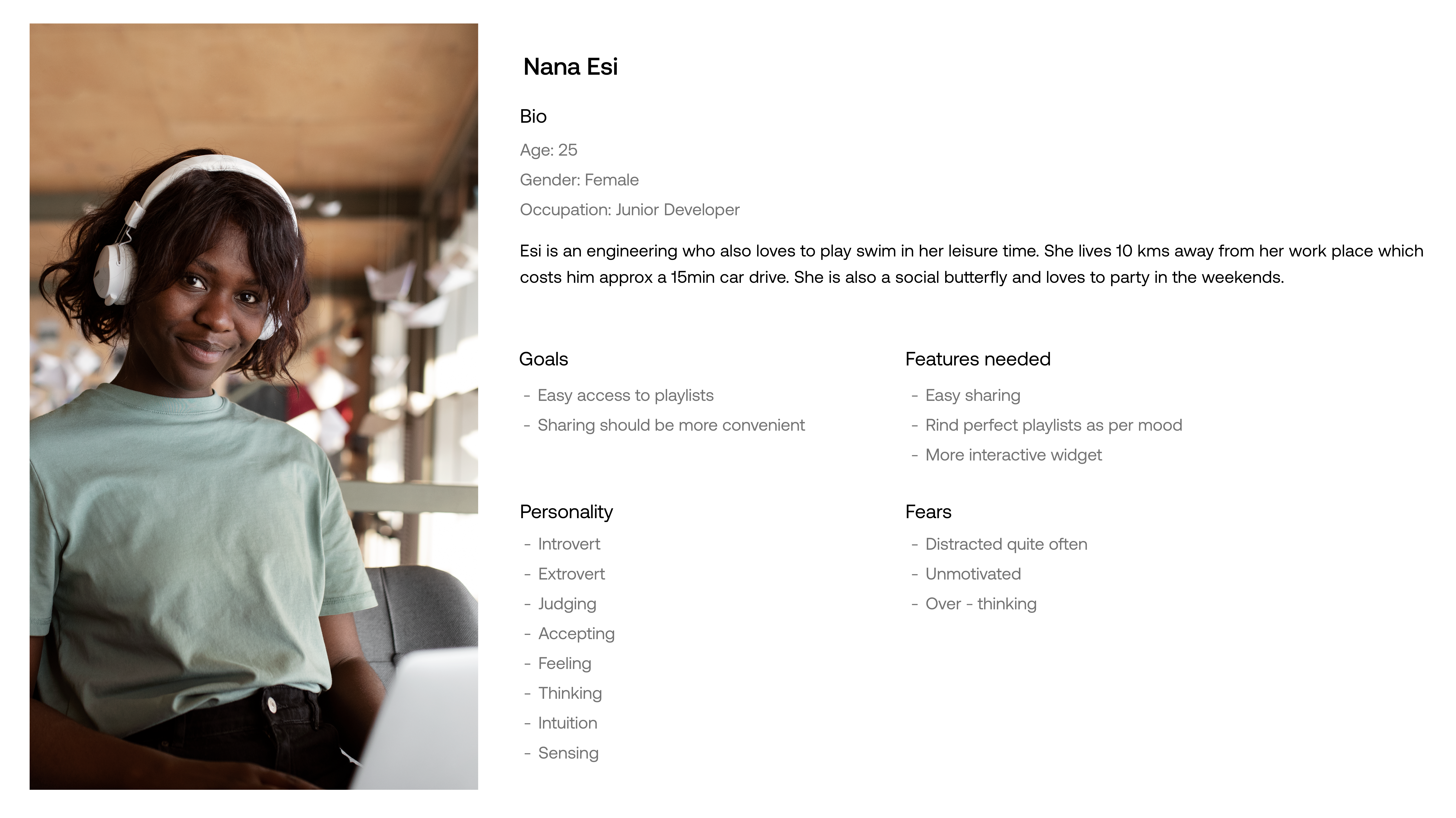
Stage 2
User Persona
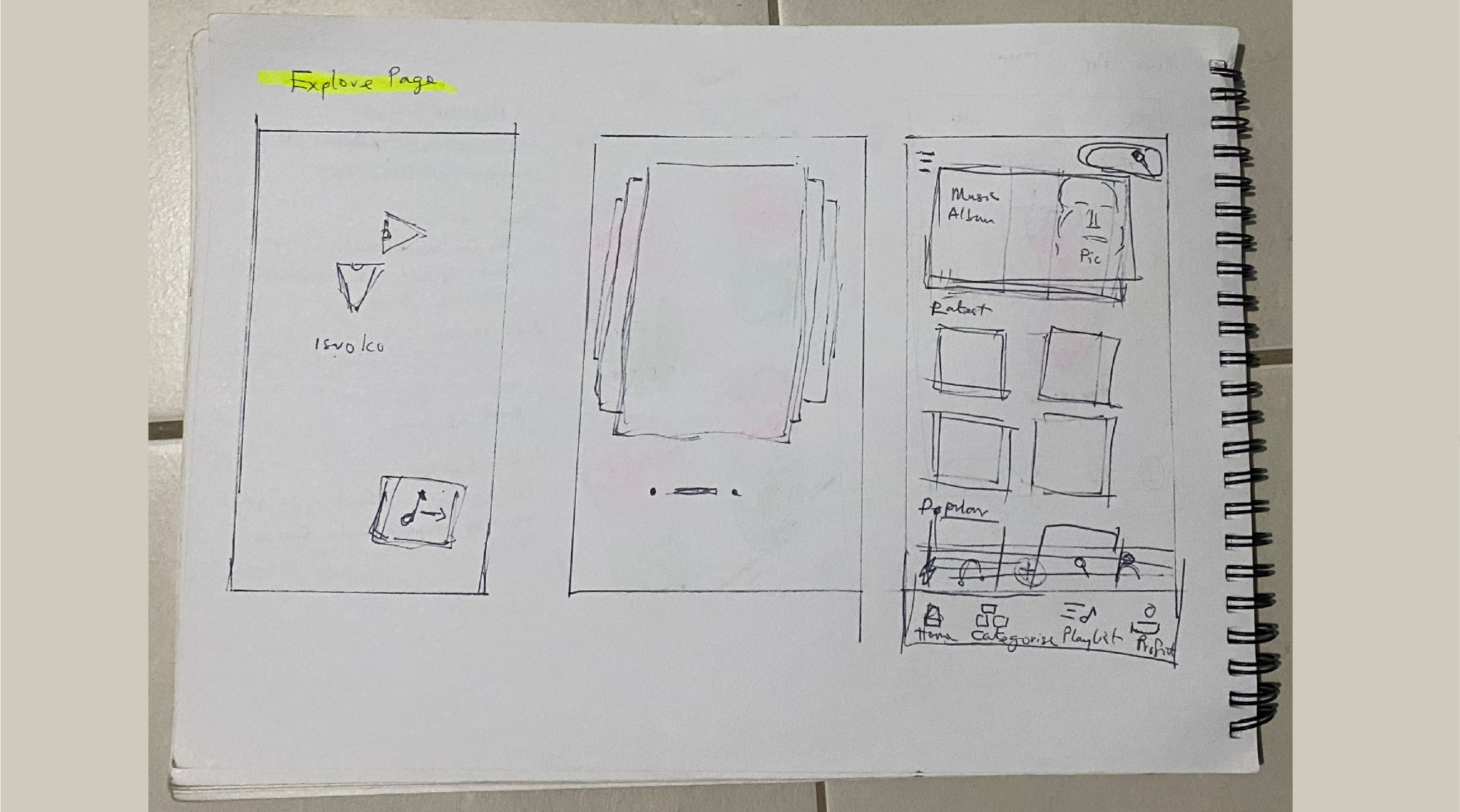
Screen Shot 1 - Explore Page / Music Feed
The explore page where in any music / song can be discovered which shows the list of latest Hindi songs and other languages. The main bottom navigation consists of Explore, Identify the music, Music Player, Radio and the Profile section which clicking on goes to the respective pages. Here, the music events happening near us are represented in next hierarchy. On clicking one event then it shows you the details of that event and if a user wants to book or register then on clicking the link it redirects to one of the application websites.
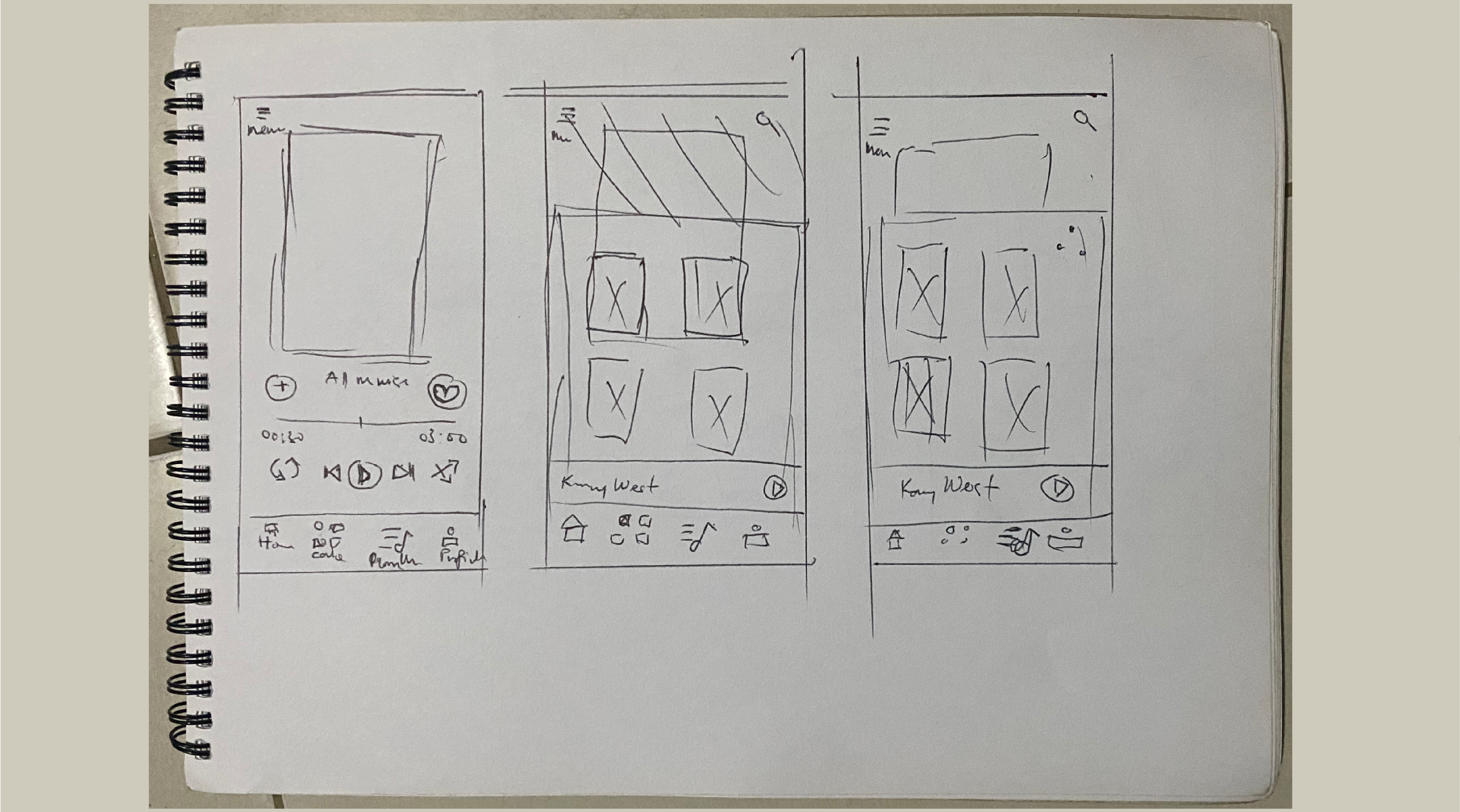
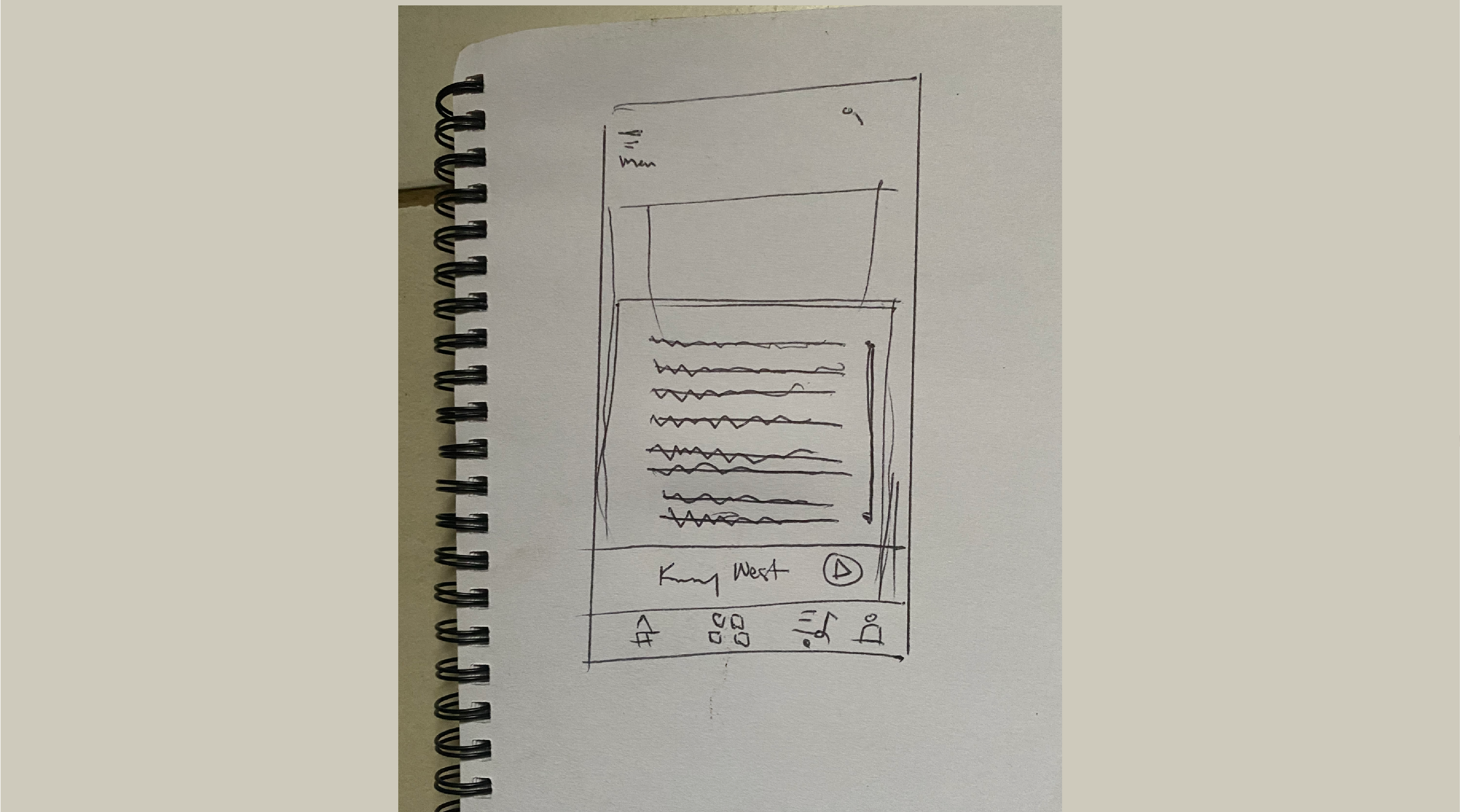
Screen Shot 2 - Music Player
Displays the current song being played with SHUFFLE, DOWNLOAD, SHARE, LIKE and More option. On clicking more option(...) the bottom pop — up pops out with other actions.
Screen Shot 3 - Bottom Pop Up
Shows the pop menu which consists of 4 features and they are SHOW LYRICS / SHOW VIDEO / IDENTIFY MUSIC The actions of these features are seen below.
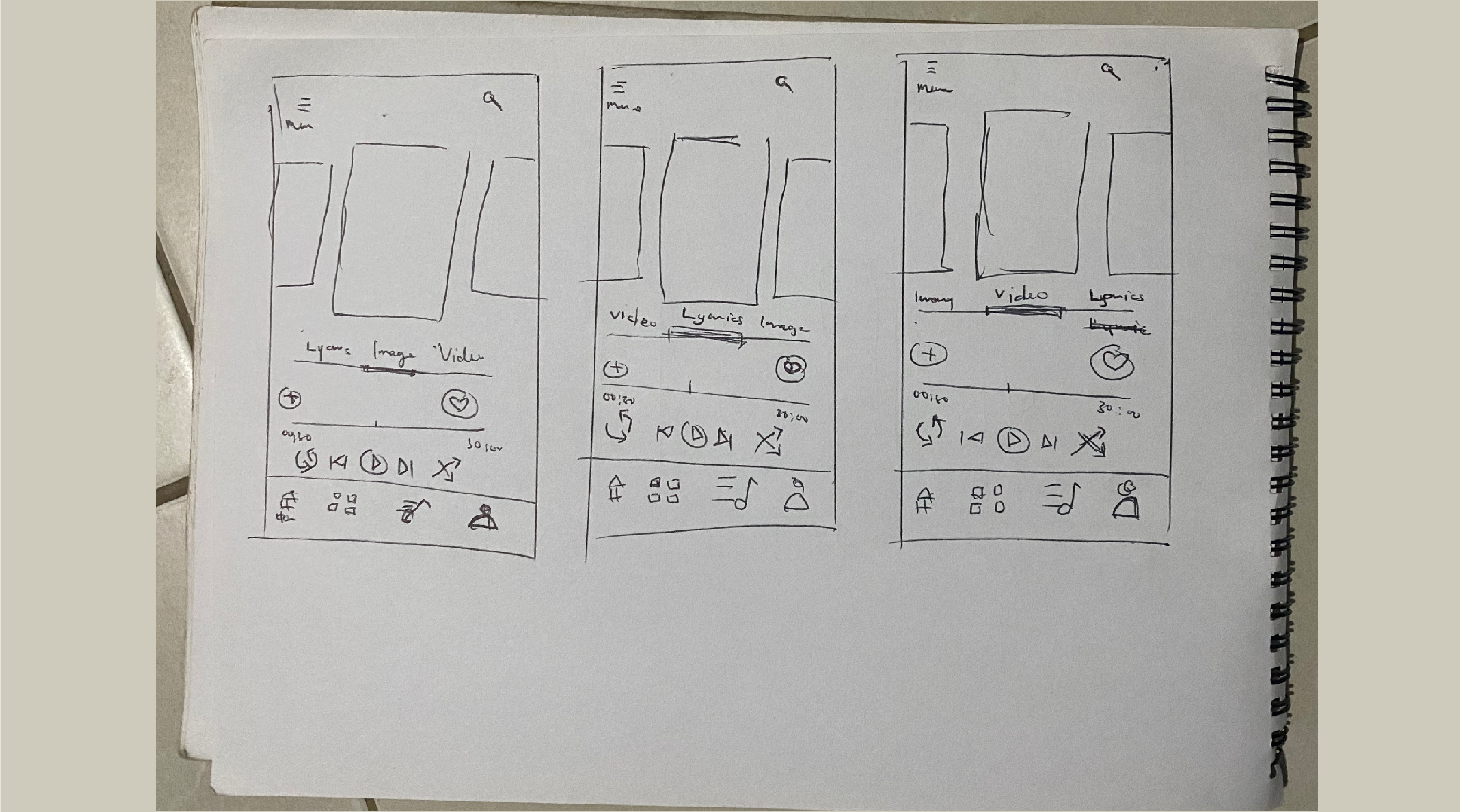
Screen Shot 4 - Show lyrics
From the pop-up menu, when the show lyrics option is selected then screen shot 4 appears. This displays the lyrics of the song for the user which is in one single interface and is easy for the user to read and sing along with the lyrics.
First video run
I focused on a lot on how the motion movement would be. I wanted it to be perky and energetic. We thought this was the way to go and after a round of feedbacks and noticed some new pain points, we went to the drawing board and made the Google home to a Pixel Slate so visually impaired users wont have bad wrist when using the interface.
Conclusion
Things I've learned
I enjoyed working on this project because it forces us to think rapidly and turn something into an awesome artifact. I really got a better understanding of the user's needs by doing a lot of whiteboarding and researching in and out about visually impaired users.
Our next step is refining our thoughts process out to a physical prototype and see how it can help visually impaired users. I would love to do some A&B testing and see what their responses are and see where we can improve on.